
Part of my exploration of visual literacy is looking at how we might teach people to express themselves visually. Part of this is learning how to draw simple objects. This video shows how you can draw a car using very simple shapes.
Some rules for effective business communication
Here are some basic rules of communication that could improve communication flow in a business. Some of them are fundamental “rules of engagement” that could set the overall tone for a company. Others are specific concepts for categorizing and measuring communication flow.
The idea is that the link between communication and action can be measured and reported. We do this for financial and product flows: Why not do it for our communication?
These ideas map to my concept of a new kind of email tool. Part of the idea requires that the sender classify every message as one of the following types: Information, Request, Order or Confirmation.
Rule 1: IROC. Classify all communications as one of the following:
- Information: No reply required.
- Request: Reply options are “Yes” or “No” (System asks “why?”). No response is considered “No”
- Order: Reply options are “Accepted” or “Rejected” (System asks “why?”). System follows up aggressively when it gets no response.
- Confirmation: Reply options are “Yes” and “No” (System asks “Why?)
Rule 2: Passive approval. “Yes” is assumed for all intra-company requests unless you hear “no” within 48 hours. “No” requires a rationale.
Rule 3: Brevity. Use short words. Use short sentences. Use short paragraphs. Be clear.
Rule 4: If it wasn’t said by email, it wasn’t said. “I told you on the phone last week,” “I told you in the hall” etc., are unacceptable.
Q-tools: An approach for discovery and knowledge work
What is information design? And in a world where, slowly but surely, everything is being translated into, and expressed as, information, how do you begin to think about organizing the massive amounts of information we’re generating every day? What are the most successful strategies for thinking with, manipulating and organizing information?
Google, one of the superstars of the information age, has recognized something important: that the internet does not need to be organized until you want to ask it a question. The entire Google business model is built around this premise: just-in-time organization. As soon as you have a question, Google will attempt to organize all available information in rank order, from most relevant to least relevant.
This would seem to be an ideal method for organizing information, and Google’s business success is a testament to this.
You can think of a question as a tool that you can use to increase your knowledge or reduce uncertainty. In fact, a question may be the most basic tool for gaining knowledge and working with information. If this is so, then it makes sense to ask which kinds of questions are best suited to different kinds of information challenges. A set of standard questions that can be applied consistently to different situations might form the basis of a standard toolkit for information discovery and design.
Q-tools
The list below attempts to define a set of “Q-tools” that may be used to generate, sort, classify and perform operations on information. This is not intended to be an exhaustive list, but more of a starting point for discussion. I have also added some alternative names for each Q-tool.
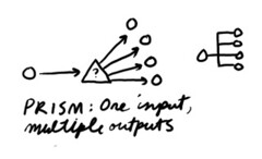 A prism is a question that divides information into smaller groups. The purpose of a prism is to break down information into categories or subgroups. An example might be “What are the parts of this system?” Prisms are used extensively in scientific inquiry. They are also used in organization design to map the departments and sub-departments of a company. An example question used in this activity might be “What roles are required to deliver this functionality?” To create a prism, define a question that can be used to divide a unit of information into its constituent parts. Alternative names: Divider, separator, splitter, brancher.
Examples:
“What are the components?”
“What is it made of?”
“What resources are required to make this happen?”
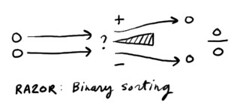 A razor is a question that divides information into two categories, based on relevance. The purpose of a razor is to define a boundary which can be used to sort any incoming information , and determine whether it lies inside our outside the boundary. A simple example: “Is this information relevant to me right now?” Productivity expert David Allen uses razors such as “Is it actionable?” as a method to process inbox information and increase productivity. A razor can also be used to sort things into rank order by asking of any two items “Which is more important?” To create a razor, define a question that can be answered only two ways, such as yes/no, or in/out. Alternative names: Cutter, fin, blade.
Examples:
“Is this relevant to the issue at hand?”
“Can it be used to…?”
“Can you eat it?”
“Can you find it in a grocery store?”
“Can it be used to make a cake?”
“Which is more important?”
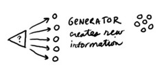 A generator is a question that has a potentially unlimited number of answers. The purpose of a generator is to explore new or unknown territory and to find knowledge that may be hidden and make it explicit. An example might be “What kinds of things are possible?” Open questions are used by inventors to stimulate discovery, for example: “How might we transport sound over great distances?” To create a generator, define a question that has an unlimited set of possible answers. Alternative names: Spout, spring, opener.
Examples:
“How might we…?”
“What might happen if…?”
“What kinds of things could…?”
“What is the meaning of life?”
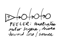 A peeler is a single question that, when repeated, drives attention to deeper and deeper levels, like the peeling of an onion. The purpose of a peeler is to penetrate beyond superficial levels in order to get to the heart of the matter. An example might be “Why?” Taiichi Ono, the designer of Toyota’s production system, described “Five whys” as the basis of Toyota’s approach, because by the time you have asked why five times, the nature of the problem as well as its solution becomes clear. But a peeler does not have to use the word “why.” Another peeler results from using the question “How does that work?” This approach has served science for many years and has led to deeper and deeper levels of the onion, from atoms to particles and beyond [Is it fair to call this reductionism?]. To create a peeler, define a single question that can be asked repeatedly to drive to deeper and deeper levels of an issue. Alternative names: Ladder, drill, hammer, spike, repeater.
Examples:
“What else?”
“And?”
“So what?” (For developing a selling story)
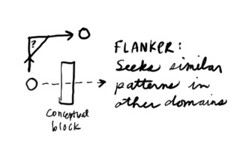 A flanker is a question that seeks patterns or ideas that are similar. The purpose of a flanker is to think laterally and find an analogous situation that may help you think about things differently. An example might be “How might you approach this problem if you were a chef?” Flankers are used to break out of existing thought patterns that may cause blind spots. To create a flanker, define a question that approaches your situation from an oblique or unexpected angle. Flanker may be a subcategory of generator. Alternative names: Similator, Analogizer, slider, sider, shifter, sidestepper, lateral.
Examples:
“How might this look from the opposite side?”
“What would we do if we wanted to create this problem instead of solve it?”
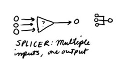 A splicer is a question that combines information, or sets, into groups. The purpose of a splicer is to find larger categories and simplify collections of information. An example might be “What do these things have in common?” Splicers are used to classify information and build hierarchical information structures. For example, any invertebrate animal that has four pairs of legs, no antennae and no wings may be considered as a members of a single class which we call arachnids. Splicers are also used in a process called affinity mapping, a process designed to find similarities in large groups of information. Another example might be “What things feel like they belong together?” To create a splicer, define a question that can be used to find commonality. Alternative names: Merger, on-ramp, combiner, fuser.
Examples:
“What are the similarities?”
“What group does this belong to?”
A pointer is a question that has a well-defined or broadly agreed-upon answer, or set of answers. The purpose of a pointer is to gather specific information, for example: “What is your name?” Pointers are used extensively to collect information for the purposes of comparison and quantitative analysis. Census data would be an example. To create a pointer, define a question that is likely to have one, and only one, answer. Alternative names: Finder, getter, coupler.
Examples:
“What is your gender?”
“How old are you?”
“What is your primary address?”
“How many languages do you speak?”
Other Q-tools that might be worth exploring:
The essay question is particularly interesting. I think there’s a benefit to a tool whose purpose is to generate a story or narrative. For example, “Tell me about a time when…”
Another might be an estimator, to use when you need to make an educated guess. Such cases are quite common in business, because most business plans are actually a combination of goals and educated guesses. Budgets, agendas and project plans are examples. An example of an estimator might be “How much will this cost?”
Another way that q-tools can be useful is to help define the purpose of a question. For example, “What is the scope of the project” could be a generator (open question, exploratory) or it could be a pointer (specific request for information). There are many occasions when a pointer could look like a generator and vice versa, causing a lot of potential confusion. Common use of q-tools would make such distinctions explicit.
1. The questions we use in tests and school might be worth exploring:
– a. Word problem
– b. Essay question
– c. Multiple choice
– d. True/false (falls under razor)
2. The Zen koan, exploring the nature of paradox
3. The riddle
I’d appreciate any thoughts that you have for additional Q-tools, as well as your thoughts about what they might be called. It seems to me that tool names should reflect the use of the tool as much as possible (a drill drills, a screwdriver drives screws, a hammer hammers, etc.). I have chosen the names with that in mind.
I’ll try to keep this list updated as new Q-tools are defined.
Update: Q-tools are mentioned in “Formality in sketches and informal representation: Some informal reflections” and I was listed as an author. My first academic paper!
Why PowerPoint rules the business world
A CALL FOR VISUAL LITERACY
In many organizations, the beginning and end of any business activity is marked by the PowerPoint presentation. In the early stages of an initiative, PowerPoint is used in strategy sessions, to present proposals and put forth plans. Later, it’s used for updates and progress reports. In the final stages, it’s used to report back and to present findings and conclusions. PowerPoint is everywhere, and it shows no signs of going away anytime soon.
Why is it used so broadly? And how did this simple tool become so entrenched in business? Here are a few thoughts:
- PowerPoint is accessible. For the novice, it’s easy to learn and use.
- PowerPoint is everywhere. Pretty much everyone has it, or has the ability to view a file. This makes it easy to share ideas and generally move meaning around. Slides can be borrowed, stolen, recycled and re-used.
- PowerPoint is flexible. The same document that is used to present information in a meeting or conference, can, with little or no modification, be emailed as a document or shared online, retaining much of its meaning.
- PowerPoint is easy to read. PowerPoint documents can be scanned and understood more rapidly than text documents. Because they are primarily visual they tend to be more easily understood and remembered.
- PowerPoint is modular. It can be broken down into single slides, which can be arranged and rearranged into numerous different sequences. Over time you can build up a storehouse of slides that represent your – or your team’s – collective knowledge about any subject, which can be distributed, shared, discussed and modified as things evolve over time.
- PowerPoint is powerful. For the more experienced user, it’s a powerful multimedia tool, with animation and other advanced effects. It’s easy to add information of any kind: Video, charts, photographs, maps – just about anything that can be digitized can be added to PowerPoint.
People use PowerPoint to represent knowledge, and the main element is relatively small and useful atomic unit we call the slide.
So what’s the problem?
“Death by PowerPoint” is the popular term for the much-dreaded meeting where a presenter subjects his audience to slide after slide, each one densely packed with bullet points or complex, confusing information, leaving the audience bored, frustrated confused.
But PowerPoint is not the enemy. When used appropriately, slides, and short sequences of slides, are excellent tools to represent knowledge. A good slide contains visual and verbal information in equal measure, and as an “information container,” a slide is just about the perfect size for memory and retention: big enough to hold meaningful information, but not so big that it’s likely to become overwhelming. A well-designed slide – one that’s comfortable to view and read – holds just about the same amount of information that you can hold in your short-term memory.
The problem is much, much deeper than PowerPoint. The issue is this: PowerPoint is a visual tool, and we are a visually illiterate society.
What do I mean by this?
In the modern world we are constantly confronted – you might say bombarded – with visual information: Television and film are the primary culprits, followed closely by billboards, brochures, and, yes, bullet points. Advertisers have long known that visualizing an idea is one of the quickest and most reliable ways to insert it into a human brain.
Due to this visual assault, we have, over time, become more sophisticated in our reading of visual information. In a world where information is digital, where photos can be altered in Photoshop and where films can show impossible things like dinosaurs and talking animals with a high degree of realism, we understand that seeing is no longer believing.
But this kind of visual sophistication is not literacy. Literacy is the ability to both read and write. If a child could read written language but not write it – if he could read a mathematical equation but not perform such operations himself – then we would not consider him prepared for success in the world.
In our school systems we teach our children the three R’s – reading, writing and arithmetic, because we believe them to be fundamental skills for successful integration in society. But the three R’s are no longer enough. Our world is changing fast – faster than we can keep up with our historical modes of thinking and communicating. Visual literacy – the ability to both read and write visual information; the ability to learn visually; to think and solve problems in the visual domain – will, as the information revolution evolves, become a requirement for success in business and in life.
PowerPoint has risen to its current position for two reasons:
- We’re processing more information than ever before, at unprecedented volumes
- We don’t have as much time to read anymore, and
- Much of the information we need to share is non-linear in nature.
PowerPoint is a visual medium. If you want to convey information visually, it’s the most accessible and ubiquitous tool there is. The answer to bad PowerPoint is not to eliminate the tool, but to improve our visual literacy. We need to teach visual literacy in our schools, and to our business people. We need an ABC book of visual language (a project I am working on).
We’re leaving an industrial age and entering an information age, yet we continue to teach, and operate our schools, as if they were factories. In an information age, visually literate societies will succeed and thrive. Shouldn’t we be one of them?
The whirl
I talk about some of the cognitive challenges of the information age, and why visual language is an important tool for dealing with them.
Forms, fields, and flows
In this short video (about seven minutes) I introduce some basic principles of visual language: Forms, fields and flows. I think of this as the “alphabet” of visual language. This set of principles is the primary set of marks you need in order to create visual meaning.
What is language?
Before we ask what visual language is, it makes sense to ask what language is. Here’s an attempt to visualize some current thinking on language. The image below summarizes my synthesis of some ideas from a book called Using Language by Herbert H. Clark.

How to draw a stick figure
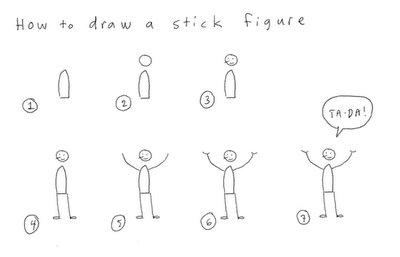 Cliff Atkinson asked if I would show how to draw a stick figure, so I decided to let you in on a little trade secret: All stick figures are not created equal. Today I’m going to teach you to draw a stick figure the way we do it at XPLANE.
Stick figures are a quick and easy way to visually represent the human body doing just about anything. I’m going to start you off easy by showing you how to draw a simple standing figure.
Here’s a larger image of the drawing above.
1. Most people start a stick figure by drawing the head. This is a mistake. Since a stick figure represents the whole person, the best way to draw it is the way you see a whole person. Think about what you notice first when seeing someone from a distance. Always start with the body. The body is the center of gravity and motion. By starting with the body you will capture the essence of the gesture you want to convey.
2. After you have drawn the body in the position that you want, draw in a circle for the head. The placement of the head in relation to the body is essential. Happiness, angst, speed and sluggishness can all be conveyed by the relative positions of the head and body. Observe people doing their daily routines and you’ll see what I mean.
3. Next, draw the facial expression. Your basic smiley face or frowney face will work here just fine. Adding a little line for a nose will help you show which direction the head is pointing. This can be especially important when you want to show two people interacting with each other.
4. Add the legs next — they are more essential to conveying the gesture than the arms. When my basketball coach taught me to shoot, he explained that the primary energy that propels the ball comes not from your arms but from your legs (Watch some basketball on TV and you can actually see this). The energy of a stick figure works the same way. Note the use of small ovals to represent feet. This helps connect the person to the imaginary ground.
5. Now draw the arms, and complete the gesture you started with the legs.
6. I made the hands a separate step so you could see what a difference a couple of little lines makes. A short, one-line stroke will suffice for nearly any gesture.
7. Of course you’re drawing the stick figure to convey some idea, action or emotion. Thought bubbles and word balloons are a great way to round out the complete thought.
Now that you’ve drawn a standing person, try your hand at some more tricky problems:
– How would you draw a tall person? A fat person? Someone with long hair or a beard?
– Go to a public place and see if you can capture the gestures of the people around you in stick-figure drawings. This is a great way to hone your observation skills.
– See if you can draw people running, dancing, fighting and sitting.
– Here’s a hard one: draw a stick figure riding a bike.
Please send me a link to your drawings so I can share your successes!
Affinity mapping
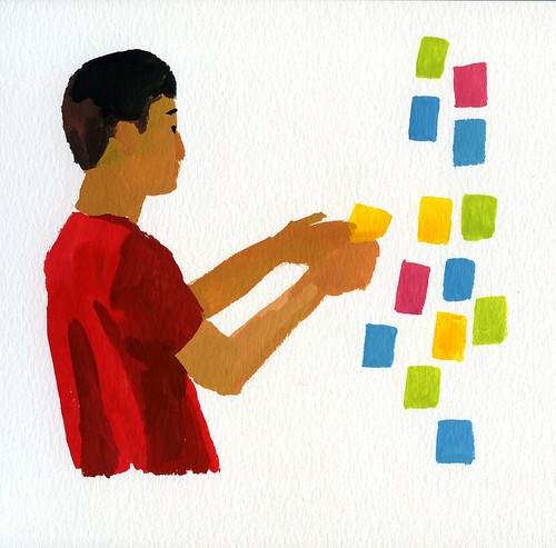
Affinity mapping is a way to sort large amounts of data into logical groups. Existing items and/or new items identified by individuals are written on sticky notes which are sorted into categories as a workshop activity. It’s a great way to get the power of a group working for you to organize information and ideas.
Read more here.
Interview: User Experience podcast
 I was recently interviewed on the User Experience Podcast:
Visual Communication – an Interview with Dave Gray
“Dave talks about giving ourselves permission to draw, about how the printing press led us to communicate in a particular way, and about how that can limit our communication in a digital environment, about how PowerPoint can be both inhibiting and comforting, and about how where we are with video today is where we were with PageMaker 20 years ago.”