Visual explanation is a journey of discovery. It starts with exploration. We start with a question and a situation we want to explore. We wallow around in a concept, looking for connections, hooks and clues. It’s an exploratory conversation with a lot of scribbles, squiggles and notes.
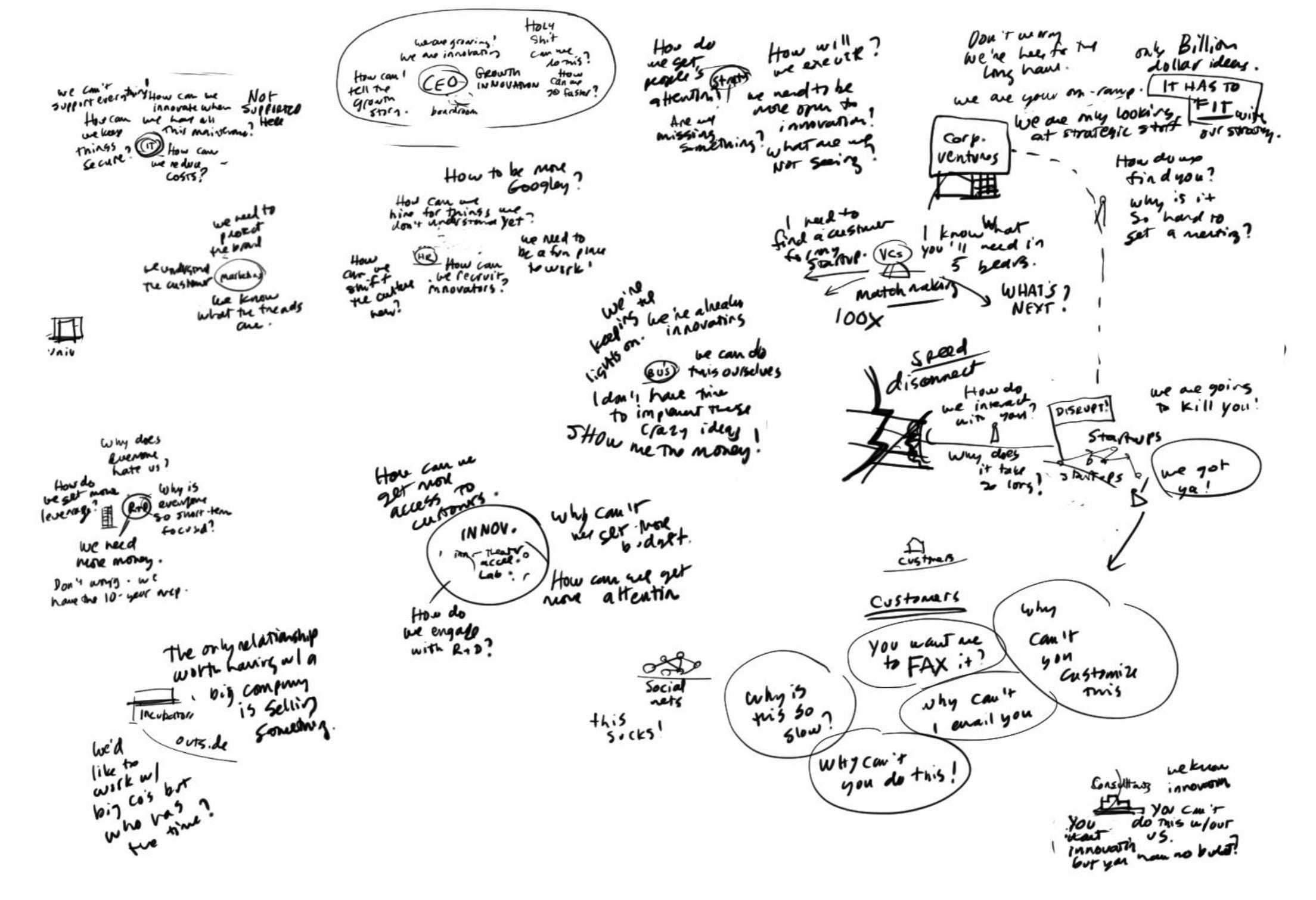
Soon we start to get a sense of the terrain, and the squiggles and scribbles start to cohere into a landscape.
The landscape evolves from a loose sketch to something with more form and structure.

But how to use the landscape to tell a story? For this we need a visual framework. We don’t put the words in right away, except maybe the headline. We are looking for a composition that people can read, a structure that will direct the flow of attention through the landscape to tell a story. Like a guided tour.
Next we put the words in. At this point I like to put the XPLANATiON into a PowerPoint slide with editable text. This makes it easy to ship it around and get feedback from various stakeholders. They can edit text or add comments.
At this point we have a testable prototype. We show it to people who are good proxies for our audience, have them read it, and then asked them what they learned. When they tell the story back to us, we can discover their “takeaways.” Did they get it? Why or why not?
And sure enough, during testing we hit a snag. A major stakeholder weighs in. He wants to see the connections and synergies more clearly. We work with him to explicitly visualize the nodes and connections
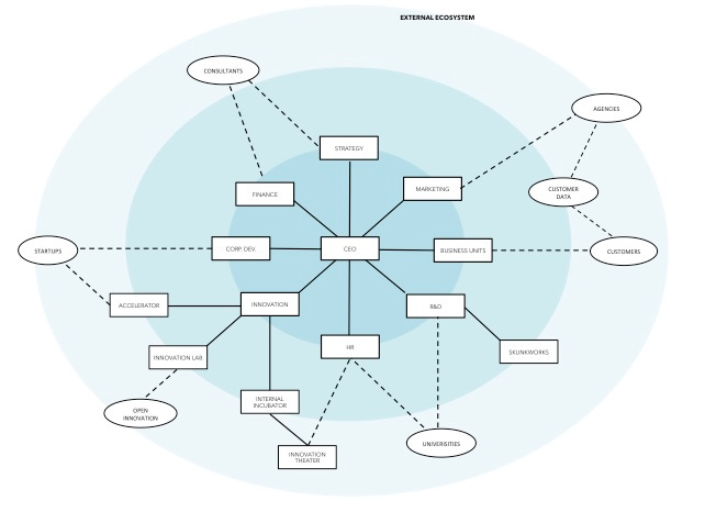
We have an “ecosystem map” but it’s still very abstract. It looks like any other PowerPoint diagram and will easily get lost in the shuffle. So we explore how we might make this more tactile, concrete.
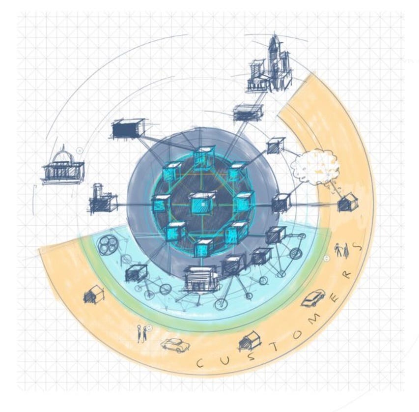
We visualize the ecosystem as a network with zones, like you might see in a subway map, radiating out from a central core. This brings us back to the idea of a city.
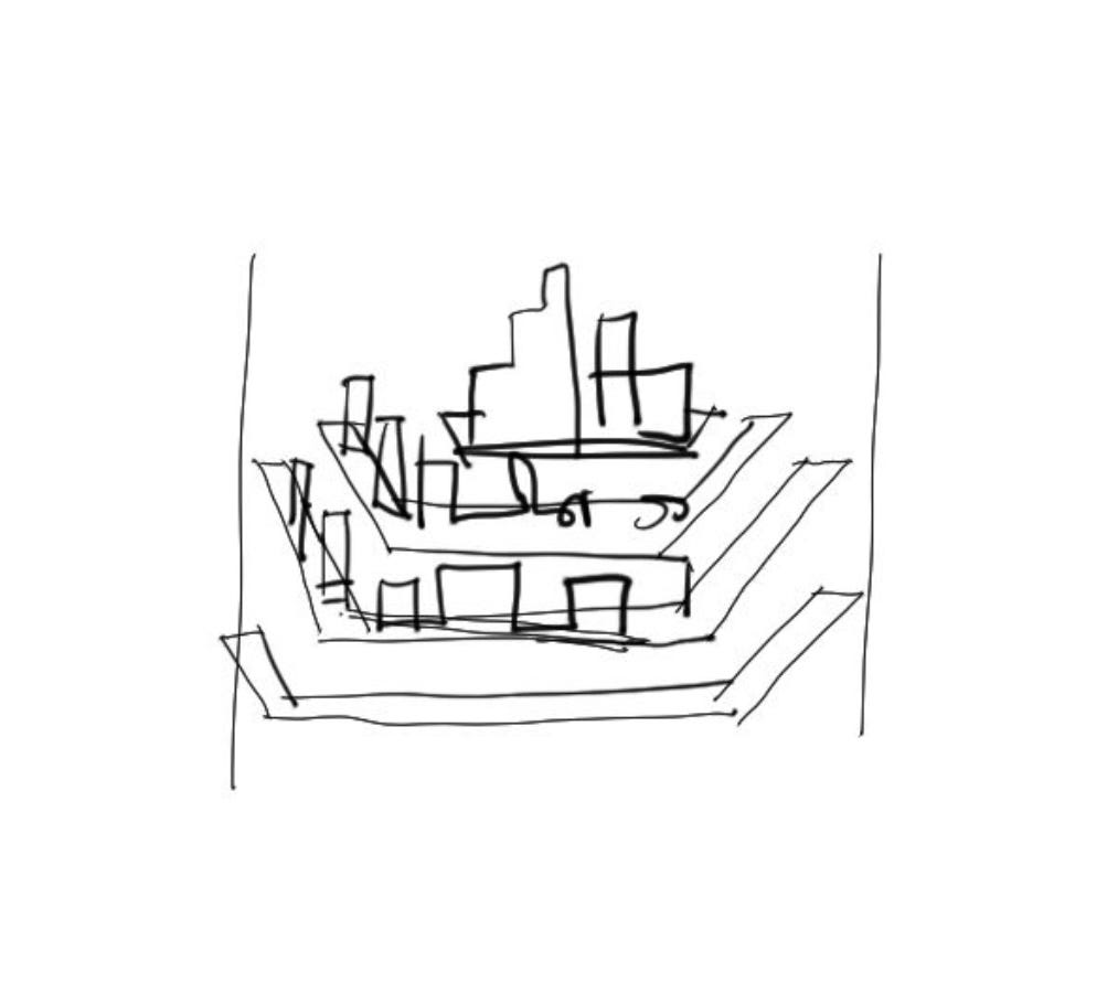
A simple sketch of a “city on a hill” with a terraced landscape hits the spot. It’s approved by our big shot and we are cleared for takeoff.
We flesh out the landscape again before we add any text, to make sure we have established the right relationships between all of the elements.
Now we are ready to create another testable prototype using PowerPoint. This XPLANATiON will be used at meetings and events to generate a flow of ideas and discussion, so we incorporate an agenda of sorts into the map. This will help groups have meaningful discussions of each zone and how they can map this picture to their world.
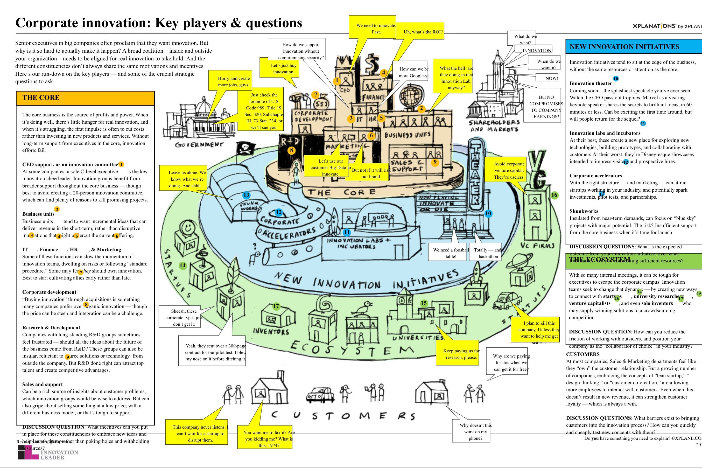
Once again we ship the slide around for testing, comments and feedback. The visual is sound, and the feedback generates a few corrections and generated additional ideas. We consolidate and incorporate these. Now we have what I call an approved “blueprint.” We are ready to take this to a professional illustrator for some gloss and finish.
The illustrator does a great job translating the sketch into a beautiful illustration. We tweak a few details during the illustration process.
The illustrator delivers the final art. Beautiful! But we are not done yet. We need to roll this out to our community.
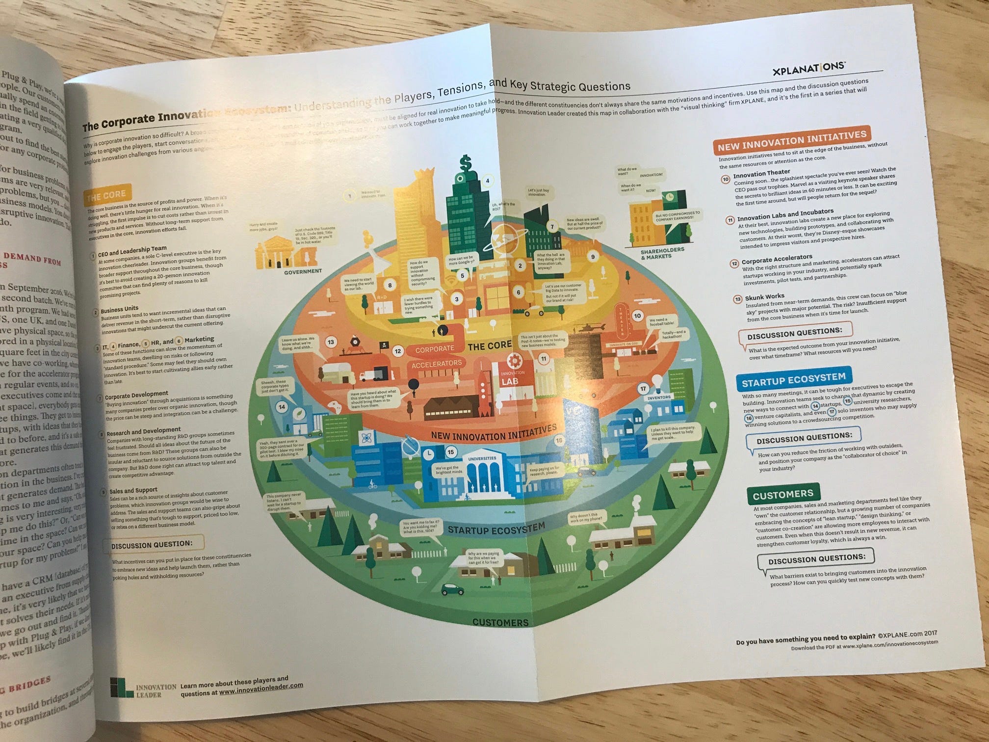
We publish the XPLANATiON in Innolead magazine as a gatefold.
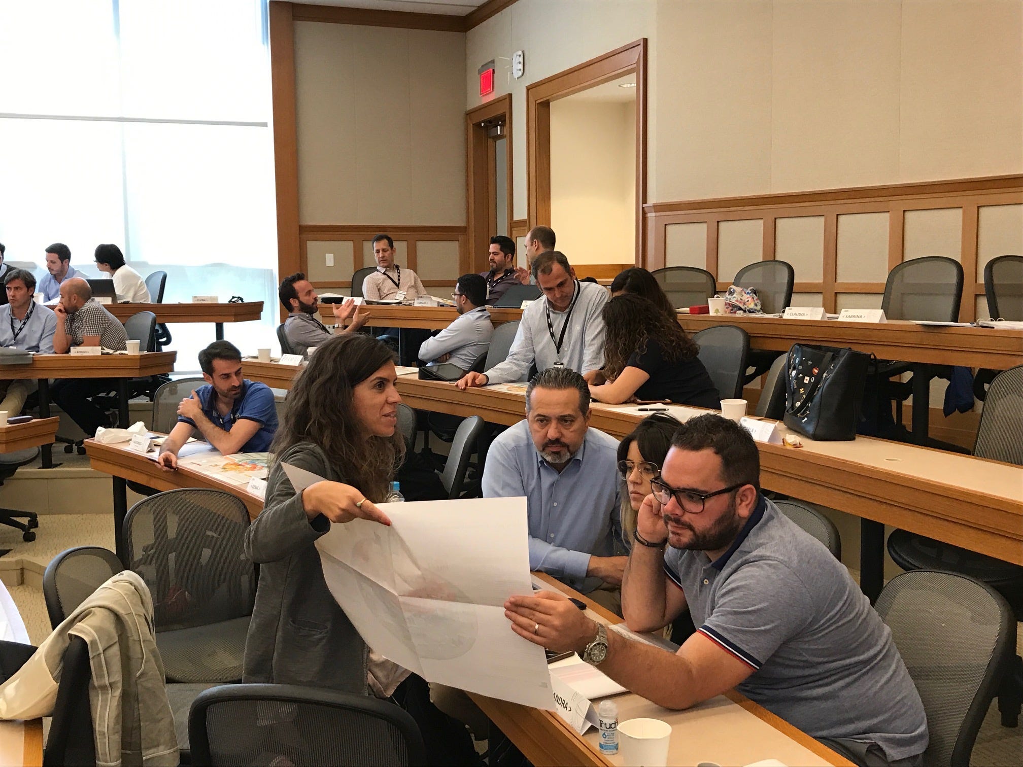
Finally, the XPLANATiON fulfills its purpose. We use it at meetings and events to generate energy and build common ground. People start to use the map to navigate complexity in their organizations and throughout the innovation ecosystem.
This XPLANATiON was so successful that it generated a continuing series called “innovation Illustrated.” Check out the whole series.